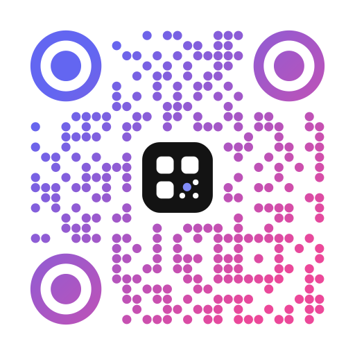
Why a logo makes your QR code stronger
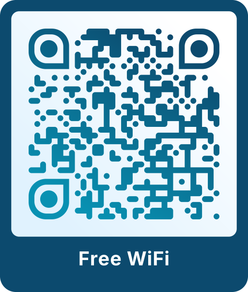
A plain black and white code looks interchangeable. With your logo and colors, people see at a glance who the code belongs to, and that builds trust before they scan. It matters on packaging, flyers, business cards and shop windows, where people decide in a second whether to pick up their phone.
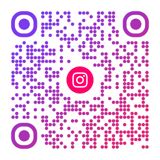
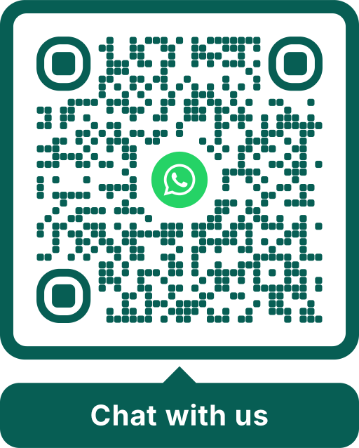
Scanoli removes the modules behind the logo, so the logo sits on a clean area instead of covering parts of the pattern. Together with the highest error correction, this keeps the code readable.
How big can the logo be?
QR codes contain redundant data. With error correction level H, up to about 30 % of the code can be damaged or covered and it still scans. Scanoli switches to H automatically as soon as you add a logo.
In practice, keep the logo at about 20 to 25 % of the code width, which is the default in the editor. Larger logos eat into the reserve that also has to cover dirt, reflections and print errors.
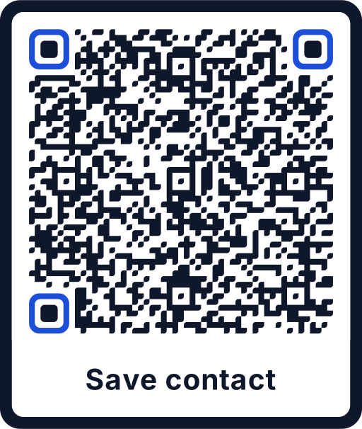
Never place the logo over the three large squares in the corners. Scanners use these finder patterns to locate the code.
Tips for a sharp logo
- Use a logo with a transparent background, ideally SVG or a PNG of at least 500 px.
- A simple mark or icon works better than a wide wordmark with small text.
- Give the logo a light area behind it if it has dark edges. In the editor this is called “Area behind the logo”.
- Keep strong contrast between code and background. Dark on light always works best.
- Test the finished code with two or three phones before printing a large batch.
Your logo stays on your device
The code and all downloads are created directly in your browser. Your logo is not uploaded to a server, and the code itself contains only your link. That makes Scanoli a good fit for company logos and client projects.
Want to go further? Use your profile photo with a small social media icon, or read how big the finished code should be in the guide on QR code size.